Funky text backgrounds with background-clip CSS
posted in:
Once of the best ways to learn new things is to see them in the wild, take an interest and give them a hack about, see what makes them tick. It's how I got started in development way back in the old days of MySpace; editing the CSS in your profile and changing things up.
A while back, I came across this funky looking text effect on Apple's website, in the iPhone HR section (it was a little while ago!).

Having had a little dig around in the behind the scenes, you might be surprised to learn that it's really quite simple, taking advantage of the CSS 'background-clip' property.
The background-clip is a CSS property that determines whether an element's background is visible/shows underneath the content's border box, padding bounds, or box of the content itself. However, you can also restrict this to just the text, which is how we're going to achieve our final look in this article. You can read more about background-clip and its uses in the ever-helpful MDN documentation on background-clip.
Here's a quick, paired back demo on how to achieve this really cool text effect for yourself.
Implementing the background-clip property on your text
Firstly, fire up your favourite editor and create a new HTML page; I used CodePen and there's a link to the completed demo at the bottom of this article.
Here's the simple code we need to get things looking almost like Apple's example:
<div class="container">
  <p>...put whatever text you like in here</p>
</div>
For the complete demo, I used the excellent Samuel L. Ipsum generator for mine, you may want something a little more 'safe for work'.
Next, our simple base styles:
html {
  font-family: 'Helvetica Neue', 'Helvetica', 'Arial', sans-serif;
  background-color: black;
  color: white;
  display: flex;
  align-items: center;
  justify-content: center;
  height: 100vh;
}
.container {
  max-width: 950px;
  font-size: 64px;
  font-weight: 600;
  background-repeat: no-repeat;
  background-size: cover;
  background-image: url(https://images.unsplash.com/photo-1553356084-58ef4a67b2a7?ixlib=rb-1.2.1&ixid=eyJhcHBfaWQiOjEyMDd9&auto=format&fit=crop&w=640&q=80);
}
Nothing too special here, just a few base styles on the document to give it a punchy look, like Apple's on the HTML, and for the .container class, we're just restricting the width and making the text bold and big.
Oh, and I found this excellent background texture on Unsplash . It's a textural image created by Paweł Czerwiński.

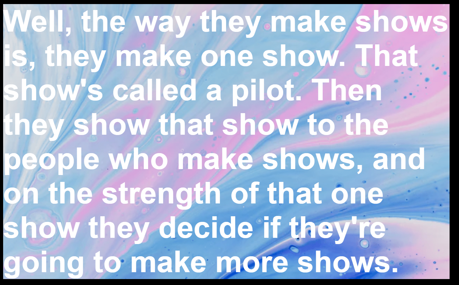
Now, without the background-clip property, it looks a little weak and unreadable, like this:
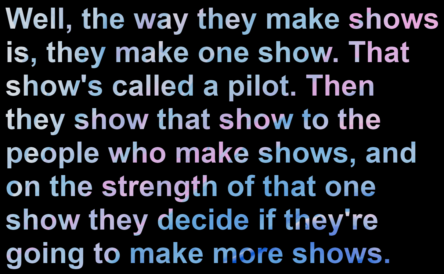
So, we need to add in the final property, background-clip: text to make the magic happen:
/* The magic */
background-clip: text;
-webkit-background-clip: text;
color: transparent;
Note: we need the color: transparent; part to make the background show through. Without it, all you'll have is white text that, whilst looking classy enough, doesn't achieve our desired effect.
Browser support for background-clip text
Support is pretty good actually with modern browsers happily clipping that text. However, in an unsurprising move, Internet Explorer does not support this CSS property. Fortunately, you can just have your text fall back to a solid colour which will work just fine.
Funky backgrounds for your text, as simple as that
And there we have it. Simple, quick, but such a striking effect that can brighten up some otherwise dull text — just be mindful of what background you choose as it can have an impact on visual impairments and make some text hard to read.
Helpful links
Here are some supporting links used in the article:
- Unsplash background image I used for the text effect
- Background-clip CSS property on MDN web docs
- Apple's use of this property on their iPhone HR webpage (archived)
- The final demo on my CodePen
- The Front End podcast (because who else is going to shamelessly promote my podcast about all things frontend?)






Comments