Building a design system using Bulma for rapid development that scales

Successful platforms have user-friendly interfaces

User interfaces are vital to the success of any website, app or platform; functionality is important too, but the interface is how you trigger that functionality, how you interact with the end product - inputting data and getting a response. Some interfaces, such as this very website, are quite straightforward: they present some static information and offer a way to navigate through that information via a menu or series of links.
Other interfaces, such as the Facebook app or IAM Cloud Portal are much more complex with lots of moving parts, buttons to trigger different functionality, and entirely separate sections to handle different features (e.g. in the IAM Cloud Portal, we have security, user authentication, and multi-factor settings in separate areas to cater for each service's very different needs).
Good interfaces rely on consistent design systems
The key to managing complex interfaces is to have a solid design system in place. A design system is a defined set of standard components or elements that can be combined to build an interface in a number of ways. It covers other areas too, such as the way it looks, spacing, animations, interactions, and colours to name a few.
A unified design system is important from an internal point of view as it helps speed up development of apps and platforms: development teams are re-using tried and tested components that interact in a consistent, predictable manner.
From an end-user's perspective, having a complex UI to navigate through is made less challenging (and more intuitive) by a design-system's consistency and familiarity. This trait also reduces UI surprises because users come to expect particular things to work in a particular way.
A design system can be relatively simple, such as a set of brand guidelines coupled with a UI component library. However, it can be a complex beast in its own right -take Google's own Material Design system as an example.
Building interfaces in-house
The big question, of course is whether you should (or could) build a bells-and-whistles design system in-house.
In smaller teams, like our close-knit, agile development team at IAM Cloud, we spend almost all of our development time building products and services that our customers can start to use sooner rather than later.
Unfortunately, this doesn't leave a lot of wiggle room to spend creating our own design systems in-house, from scratch. However, there are a lot of existing design systems out there that development teams have been using for years - frameworks such as Twitter Bootstrap or Foundation by Zurb .
In IAM Cloud (and just about anywhere else I can use it) we use Bulma.
What is Bulma?

Bulma is a CSS framework based around modern CSS approaches, such as Flexbox. It's a competitor/alternative to the popular Bootstrap from Twitter.
From their own website:
Bulma is a free, open source CSS framework based on Flexbox and used by more than 150,000 developers.
Why I use Bulma to build user interfaces
Since joining IAM Cloud, I've been responsible for bringing the new UI of our revamped products to life. Ultimately, Bulma offers a way for us to build-out our own, IAM Cloud-branded design system and UI component library, without the addition of too much code weight or opinionated JavaScript (JS) bundled in.
Among other features, I especially like:
- Bulma's simple, lightweight code base.
- The lack of JS bundled in with the framework - this enables us to include our own JS support and functionality where needed, however we choose.
- That it takes a very modern approach to CSS, using Flexbox to achieve a simpler grid system (or hit the holy grail of vertical centring!).
- The customisation opportunities Bulma offers, as well as the ease of adding new components.
- The leaning towards a more Functional CSSstyle with modifier classes to adapt components.
- That it offers a React JS-friendly version, provided via the NPM repository.
Bulma is also well supported by a growing community of developers and an impressive approximate 400K downloads per month.

From a development angle, using such a consistent UI framework, with a predefined component library, allows us to manage UI changes across different apps much faster and implement new features more quickly.
The UX/UI design and deliberation time is reduced, because we don't have to focus as heavily on how things will ultimately look - we're already working within a branded component framework! We just have to decide how to put the pieces together to form a new section or feature (like our in-progress SSO/AUTH product revamp ).
How I use Bulma in user interfaces
Currently, I work within a mix of front-end technologies to develop applications, but mainly React. I'm transitioning over to React for new projects and slowly migrating any legacy code bases over.
Before diving into any new projects with IAM Cloud, however, I was able to build a lightweight UI component library to demonstrate how our styled and branded components should look, including their various options. It involves deployable assets (including CSS and JS files) but a 'live' demo site to showcase the components.
With that in place, our new projects can begin with our branded Bulma base. This means that any new interfaces we produce can quickly have that familiar, IAM Cloud-y look and feel that our customers have come to know.
As an example, let's take a brief look at how we're building our new SSO/Auth product interface.
Step one - we begin with wireframes
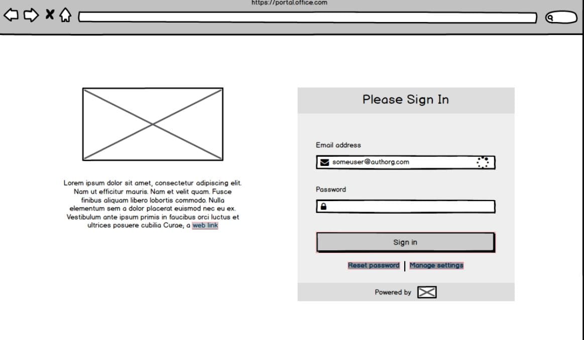
IAM Cloud's Simple Single Sign On is an authentication and single sign on system managing any organisation's sign on and multi-factor authentication needs. However, as I wrote about in my recent article on developments at IAM Cloud , we're revamping and redesigning our product lines, starting with SSO. Before we turn to our Bulma library, we started things off with a set of sketch wireframes like these:

Whilst a little rough and ready, this basic visual layout provides a guide to how a feature might look and function before we spend a lot of costly development time heading down the wrong path. Already, as you'll see in the next screen shot, we can start to break up the whole interface into smaller, isolated parts that translate into components within our Bulma-based library.
Step two - translate wireframes into living interfaces
Now that we have a general direction to work from, I can start to build up the real interface using the Bulma UI component library. Here's a sneak peak of our the new redesign:

Although still very much a work in progress, you can see how we are able to take a sketched idea and quickly turn it into a working model.
What are your experiences with design systems
Do you have any? What do you build applications or sites with in your team? Home-grown, off the shelf, hybrid-style? Bosh some details in the comments and let's have a discussion!


Comments